
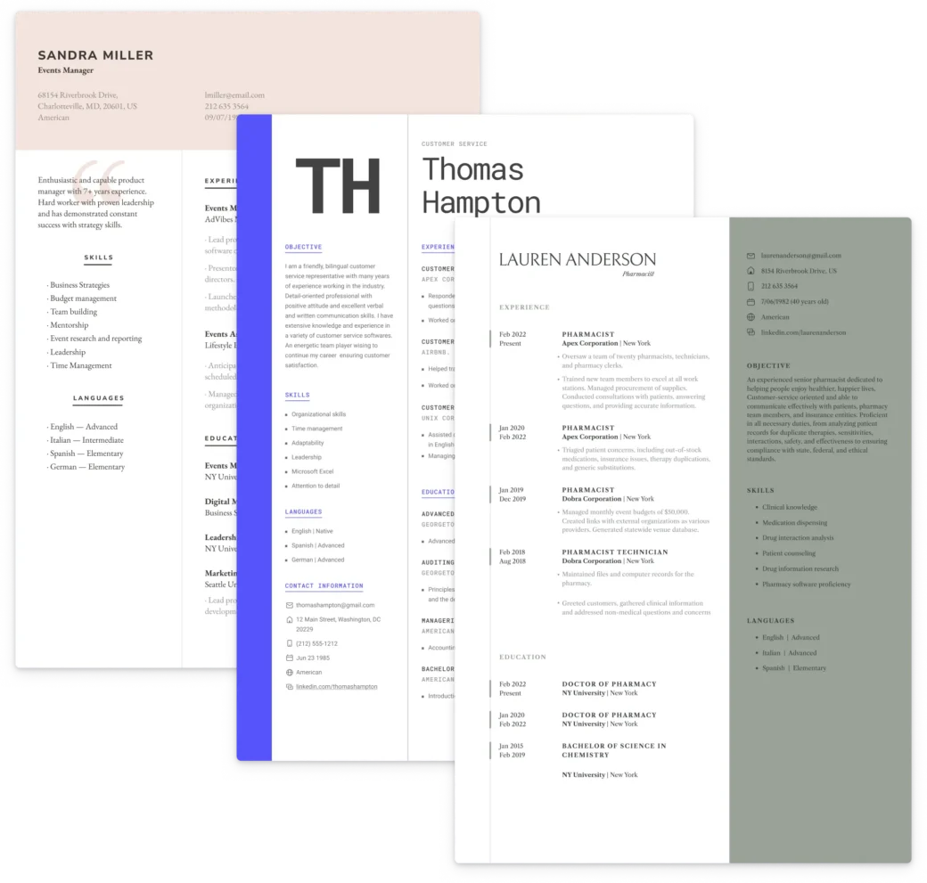
Are you tired of submitting bland, uninspiring resumes that fail to capture the attention of potential employers? Adding a touch of color might be the solution you need to make your application stand out.
However, it’s crucial to use color wisely. A resume that looks like it was scribbled on with crayons will likely be dismissed at a glance.
In this article, we’ll explore:
- Whether you should incorporate color into your resume
- The best color schemes to use
- The pros and cons of adding color to your resume
Additionally, we’ll provide tips on using resume templates and pre-made color patterns to ensure your resume is both eye-catching and professional.
Keep reading to discover the best colors for a resume and how to avoid overdoing it.
Should I Add Color to My Resume?
You might be looking at your resume and feeling it’s a bit bland. Or you’ve had some job applications rejected and are thinking of ways to get more positive feedback from employers.
So, is adding color to your resume the answer?
The truth is up to 90% of an initial impression can be attributed to colors alone, but you’ll need to go about it the right way.
For example, you may be applying to a job for which certain colors on your resume would seem inappropriate. For example, adding fluorescent green to a resume when you’re applying for a role in finance may not be the best choice.
When deciding if having colors on your resume is right for your job application, you’re going to have to weigh the positives and negatives.
Pros and Cons of Adding Colors to a Resume
While having a resume that’s black and white may seem dull, it might actually be the best option. Here’s a closer look at the pros and cons of adding colors to your resume:
Pros 👍
- Makes your resume stand out: A touch of color makes your application visibly different from the competition and can catch the recruiter’s eye.
- Shows off your personality: Adding color to your resume allows you to focus on your personality and creativity like adding hobbies and interests would.
- Highlights important information: If you’re trying to draw attention to a specific section of your resume, using color can help.
Cons 👎
- May not be seen as professional by some: While adding color can be eye-catching, adding certain colors may not be seen as professional in more conservative industries.
- Can be distracting: If you use too many colors or select colors that stick out and divert the attention from the text, your resume may become ineffective
- Not every company will appreciate it: Some companies have strict guidelines for resume format, and adding color may not be appreciated.
By doing research on your position, the company’s culture, and the colors of the company’s logo, you’ll know you are using the correct resume format and fitting colors to impress the hiring manager.
For instance, a graphic designer’s resume can incorporate more color and creativity compared to the more conventional style typically used in traditional corporate roles.
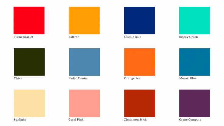
What Might the Colors on My Resume Say About Me?
You will need to choose the colors you use on your resume wisely.
The palette below outlines some of the adjectives or traits associated with different colors.
Of course, it is not 100% clear cut, and remember that different cultures may associate these colors with different meanings.

Take this resume color psychology into consideration when preparing yours.
What situations are best for colors on a resume?
When you’re thinking about adding some color to your resume, it’s all about the industry rather than the size of the company.
Creative fields like graphic design, marketing, or advertising often appreciate a splash of color and a bit more flair. But if you’re aiming for a role in a more traditional field, like finance or administration, it’s usually safer to keep things clean and professional.
Also, remember that many companies use Applicant Tracking Systems (ATS) to sort through resumes. If your resume design is overly complex, it might not get read properly by these systems, which could hurt your chances.
It’s all about finding that sweet spot between creativity and practicality based on where you’re applying. You’ll want to make sure:
- There is a high contrast between the text and the background
- You choose your colors conservatively
- Make sure you don’t include any colorful graphics, as the ATS software cannot read these
Best Professions for Using Color on a Resume
If you’ve decided to add more life to your resume, you may be wondering what the best color scheme is, depending on the role or industry.
In more conservative fields, such as finance, civil service, or for a Lawyer resume, the best colors to use will be more traditional.
In professions like these, you’ll want to use color schemes for your resume based on the following colors:
- Royal blue
- Royal purple
- Bronze
- Maroon
However, in creative industries like marketing or for a 3D Artist resume, adding a splash of color that shows off your artistic side can make your document stand out from the other applicants.
Some of these colors include:
- Light pink
- Claret
- Orange
- Light green
Of course, it is essential to add these colors sensibly without causing any problems that may make it difficult for a recruiter to read your resume.
Build your perfect resume with ease
Craft the perfect resume effortlessly with our builder. Get started today!
Tips for Adding Color to a Resume
Now that you understand which colors you should add depending on your industry, there is still some critical advice that you should follow.
Take advantage of an online resume builder and follow the advice below to help you create a work of art.
- Use color sparingly: You don’t want to overload your resume with color. Stick to one to three accent colors and use them consistently throughout your document.
- Consider the company culture: If you’re applying to a company with a specific brand color, try to incorporate that into your resume.
- Make it readable: Use a clear, easy-to-read font in black or a dark color to ensure that your resume is still easy to read. Use bullet points still, and leave plenty of white space to balance it out.
- Avoid light colors on white backgrounds: Your resume should have a white background, which means using colors like bright yellow would be counterproductive.
- Take advantage of color schemes: A tidy color scheme is a great way to make the colors on your resume flow together.
The key takeaway is that color should be used to enhance your resume, not dominate it.
That means using the correct colors and resume format, a distinctive, catchy header, and clear sections that highlight your best attributes.
Highlight your skills if the job is more likely to be influenced by skills-based hiring, for example.
It’s important to approach color with the right ideas and select the correct hues for your application. With these tips, you can ensure that your colorful resume gets noticed for all the right reasons.
FAQs
Using color on your resume is not inherently unprofessional; it can enhance your document’s appeal if applied thoughtfully. Color can help highlight key sections and make your resume stand out, especially in creative industries.
However, it’s important to use subtle, complementary colors that maintain a professional appearance. Overly bright or clashing colors can be distracting and may detract from the content. Always tailor your use of color to the industry and the specific job you are applying for.
The best color to use on your resume largely depends on the industry and the impression you want to convey. Blue is often considered the most versatile and professional choice, symbolizing trust and reliability, making it suitable for roles in finance, law, and management.
For creative industries, colors like teal, coral, or slate blue can showcase creativity and align with company branding. Ultimately, choose a color that complements your personal brand and aligns with the expectations of your target industry.
Colors on a resume can convey specific meanings and evoke emotions that influence how hiring managers perceive applicants. For example, blue often represents trust and reliability, making it ideal for professional roles.
Red can symbolize passion and energy and is suitable for creative or high-energy positions, while green is linked to growth and stability and is suitable for finance or environmental fields. Using colors strategically can enhance your resume’s appeal, but it’s essential to ensure they align with the industry and role you’re targeting.
Related Posts