

Your resume is often the first glimpse a hiring manager gets of who you are, so every detail counts. While your skills and experience take center stage, the way your resume looks can make or break that crucial first impression.
In this guide, we’ll help you choose the perfect font to ensure your resume stands out for all the right reasons. Here’s what we’ll cover:
- The best fonts and sizes to use for a professional, readable resume
- How your font choice impacts hiring managers and applicant tracking systems (ATS)
- Practical tips for formatting your resume to look polished and modern
Let’s get started!
What’s the Best Font for a Resume?
You only have one chance to make a first impression, and choosing the right font for your resume plays a key role in achieving this. The correct font invites hiring managers to easily navigate your document and focus on your skills and experience.
With countless fonts available, here are 10 highly recommended options for creating a professional resume, along with why they work so well.
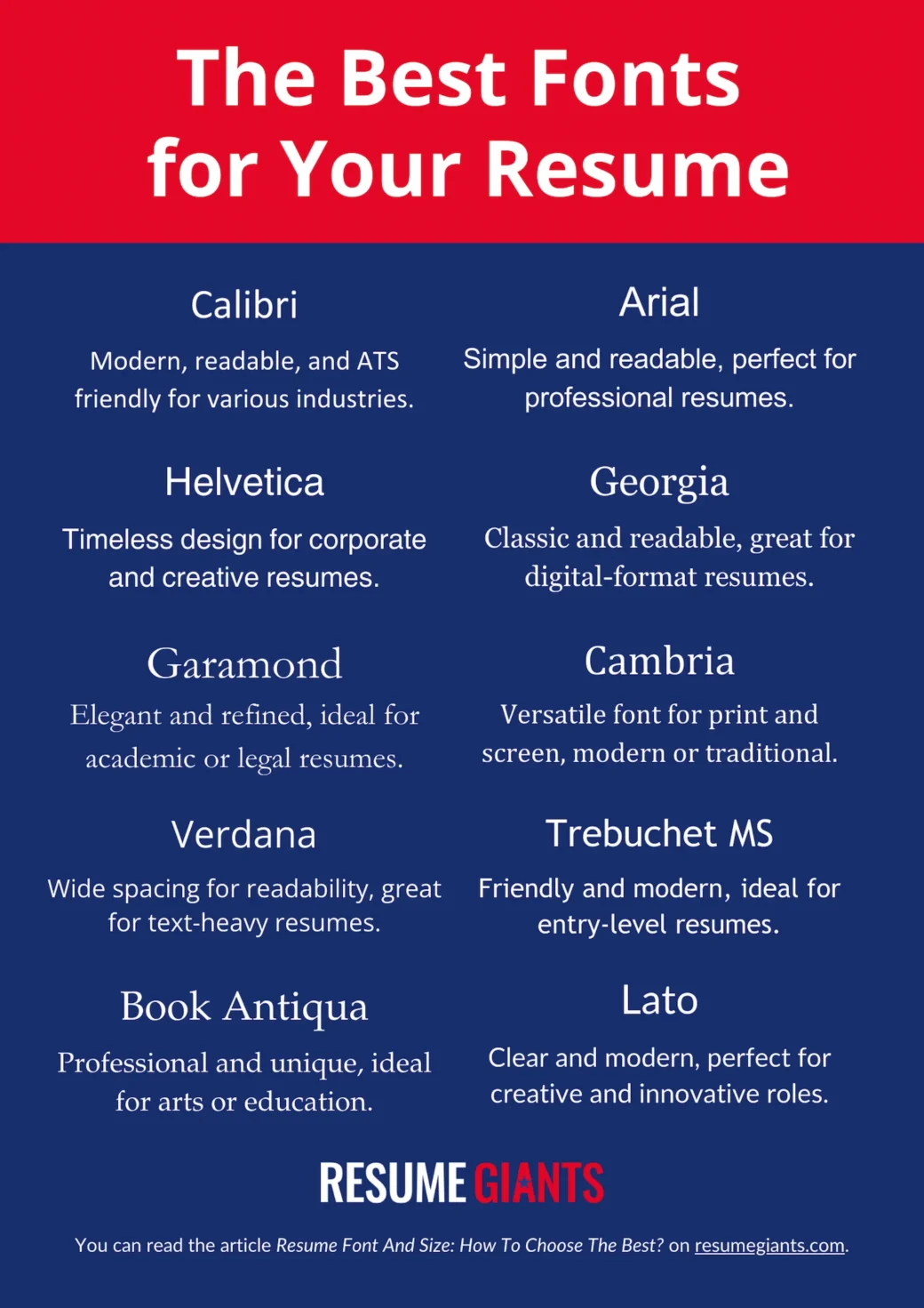
Calibri
Calibri is modern, clean, and easy to read both on-screen and in print. Its balanced design makes it a safe choice for most industries, and it’s also ATS-friendly, ensuring compatibility with applicant tracking systems.
Arial
Arial’s simplicity and familiarity make it one of the most widely used fonts in professional settings. Its clean lines ensure readability, helping hiring managers quickly scan through your resume without distractions.
Helvetica
With its sleek and timeless design, Helvetica exudes professionalism. Its polished appearance makes it particularly effective for resumes in corporate or design-focused fields.
Georgia
Georgia is a serif font designed for screen readability, making it an excellent choice for digital resumes. Its classic yet approachable style works well across various industries.
Garamond
Garamond’s elegant and traditional design lends a touch of sophistication to your resume. It’s ideal for roles in academia, law, or other formal professions where a refined look is valued.
Cambria
Cambria was specifically created for on-screen reading but also looks great in print. Its professional and versatile style suits both traditional and modern industry resume templates.
Verdana
Verdana features wider spacing and clean lines that enhance readability, even at smaller font sizes. This makes it perfect for text-heavy resumes or those tailored for digital formats.
Trebuchet MS
Trebuchet MS offers a slightly modern twist with rounded edges, giving your resume a friendly yet professional tone. It’s particularly effective for creative or entry-level roles.
Book Antiqua
Book Antiqua is a graceful serif font that conveys professionalism with a touch of individuality. It’s an excellent choice for arts, humanities, or education-related roles.
Lato
Lato is a contemporary sans-serif font that balances clarity with subtle personality. It’s ideal for creative industries or roles where modernity and innovation are key themes.
💡top tip
When selecting a font, prioritize readability and professionalism to ensure your resume leaves the best possible impression on hiring managers while remaining ATS-compatible!
Consider using our professional resume builder. It has all the tools you need to create the perfect resume in the right font.
What Size Font Should You Use on Your Resume?
When deciding what size font for your resume works best, it’s important to strike a balance between readability and professionalism. The right font size ensures your resume looks polished and is easy to scan at a glance.
Take a look at these tips to find the right font size:
- Use a font size between 10 and 12 points for optimal readability and professional appearance.
- This range helps keep your resume concise, typically within 1 to 2 pages.
- Start with size 10 and adjust to 11 or 12 if you have extra space.
- Avoid going below 10 points, as smaller text can strain the reader’s eyes and make your resume harder to read.
- If your resume slightly exceeds 1 page, revise and trim unnecessary content to fit it onto a single page, focusing on key skills, experience, and qualifications.
How To Choose The Best Font and Size for Your Resume
Choosing the right font and size for your resume can feel overwhelming with so many options available. Your goal is to select a style that grabs the recruiter’s attention, ensures readability, and passes through Applicant Tracking Systems (ATS) without issues.
Below, we’ll break down how to make the best choice based on industry, readability, and ATS compatibility.
1. Choose fonts based on your industry
Different industries have varying expectations for resume design, and your font choice should align with the tone of your field:
- Corporate and traditional roles: Stick to clean, professional fonts like Arial, Calibri, or Cambria. These fonts convey reliability and professionalism, making them ideal for industries like finance, law, or administration.
- Creative fields: For roles in design, advertising, or media, you can experiment with more artistic fonts like Helvetica or Lato. These fonts balance creativity with professionalism while showcasing your personality.
- Academia or formal professions: Serif fonts like Georgia or Garamond are great options for their classic and refined appearance, which aligns well with academic or research-focused roles.
2. Prioritize readability
A clean, well-organized resume is easier for recruiters to scan and leaves a stronger impression:
- Use a font size between 10 and 12 points to ensure your resume is easy to read.
- Avoid overly decorative or script fonts that can distract from your content.
- Use bolding sparingly to emphasize section headings or job titles but avoid overloading the page with too much emphasis.
- Steer clear of excessive underlining as it can clutter the document and reduce readability. Instead, rely on consistent formatting (e.g., bold titles and bullet points) to guide the reader’s eye.
3. Ensure ATS compatibility
To make it past applicant tracking systems, your font and formatting need to be both simple and widely recognized:
- ATS software often struggles with non-standard fonts and complex formatting. Stick to widely recognized fonts like Arial, Calibri, or Times New Roman to avoid errors in how your resume is parsed.
- Avoid using symbols, special characters, or text boxes that may not translate properly in ATS systems.
- Save your resume as a plain-text-friendly file type (e.g., PDF or Word document) to ensure compatibility across platforms.
Consider these factors and confidently select a font and size that enhances your resume’s impact while maintaining a professional edge.
Types of Resume Fonts to Avoid
When choosing fonts, there is a method to avoid the options that produce poor or adverse results for your resume. Here’s what to avoid:
❌Non-Standard, Custom Fonts:
Avoid fonts in Word professors that need to be downloaded to be used. These options aren’t standard to operating systems and may also be converted inaccurately by an Applicant Tracking System (ATS).
❌Heavily stylized fonts:
Heavily stylized fonts shouldn’t be part of your resume since the Applicant Tracking System (ATS) can’t read them. Besides the programs, even humans encounter great difficulty with this type of font.
❌Gimmick Fonts:
Gimmick fonts like Papyrus, Comic Sans, and Wingdings should not appear in your resume as they are strictly unprofessional.
Your resume is a corporate document, and it must reflect the attitude of a business person, which gimmick fonts do not portray.
❌Narrow or Condensed Fonts or Versions of Fonts:
Narrow or condensed fonts render poorly on most screens, making it tricky for the human eye to understand the content. This factor completely discourages recruiters from continuing with your resume.
💡top tip
Keep in mind that once you’ve chosen a font, it’s important to use it consistently across your resume, cover letter, and other application materials. This creates a cohesive and professional look, presenting your documents as a unified, polished package.
What about bold and italics?
While we recommend being straightforward in your resume and avoiding overwhelming the document with creativity.
The same applies with bold and italics; however, these two elements can be used in the document to draw attention to specific areas of the resume.
Italics are useful for supporting text, like city, state, and university, bringing them to light without enlarging the text. However, note that underlining words or phrases in a resume or cover letter is unnecessary, as they add too much formatting and make the document cluttered.
Visit resume giant for a perfect resume example with the correct fonts and format.
Can You Use Multiple Fonts on a Resume?
Yes, you can use multiple fonts on a resume, but it’s important to do so thoughtfully and sparingly. Combining fonts can help create visual hierarchy, making your resume easier to read and more organized.
For example, you might use one font for section headings and another for the body text. However, the fonts must complement each other—mixing overly different styles can make your resume look cluttered or unprofessional.
When done correctly, using multiple fonts can:
- Highlight key sections like your work experience or skills.
- Add subtle personality while maintaining professionalism.
- Improve readability by creating clear distinctions between sections.
That said, finding the right font pairings and balance can be tricky. This is where our resume builder comes in!
Our professionally designed templates are designed with pre-selected font combinations that ensure your resume looks polished, ATS-friendly, and tailored to your industry.
With just a few clicks, you can create a standout resume without worrying about formatting or design missteps.
Let us handle the details so you can focus on presenting your skills and landing the job!
Final Word on Resume Fonts
Your resume is your ticket to making a strong first impression, and choosing the right font and size is a crucial part of that process. Whether you stick to a single font or use carefully chosen combinations, the key is to prioritize clarity and professionalism.
Key takeaways:
- Use clean, professional fonts like Calibri, Arial, or Georgia, and choose a font size for your resume between 10 and 12 points for readability.
- Match your font style to your industry—classic for corporate roles, creative for artistic fields.
- Ensure ATS compatibility by avoiding overly decorative fonts or complex formatting.
- Experiment with multiple fonts using pre-designed templates to create a polished and organized look.
Ready to create a resume that gets noticed? With our resume templates, you can skip the guesswork and start writing a standout application today!
Build your perfect resume with ease
Craft the perfect resume effortlessly with our builder. Get started today!
Related Posts